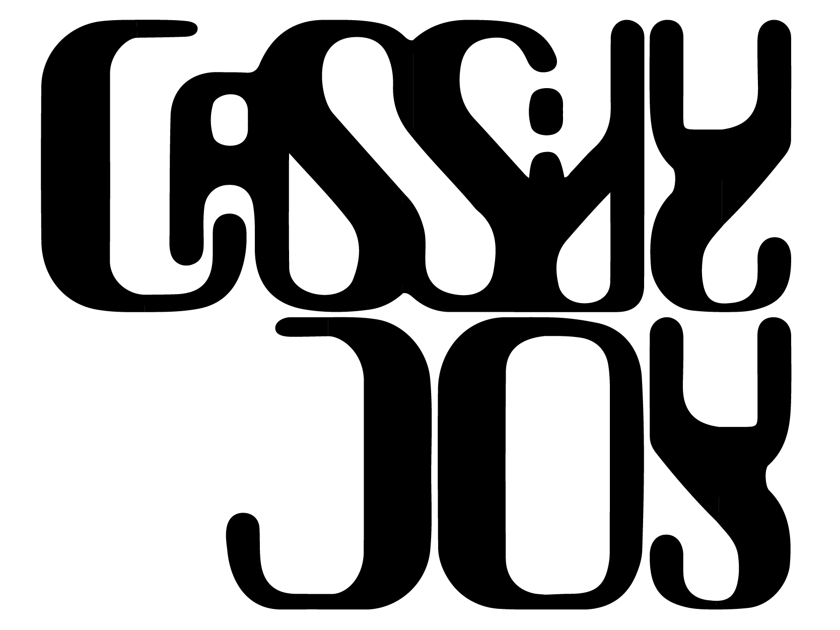
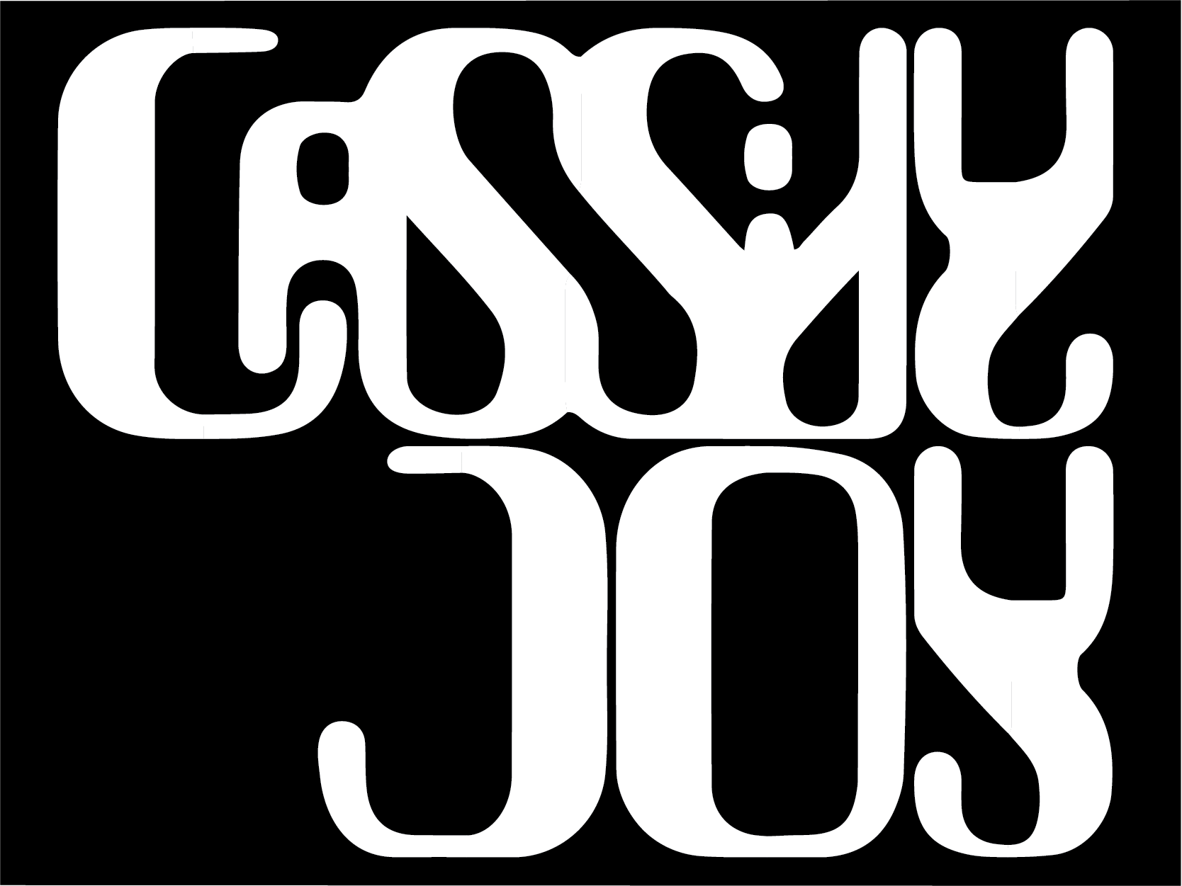
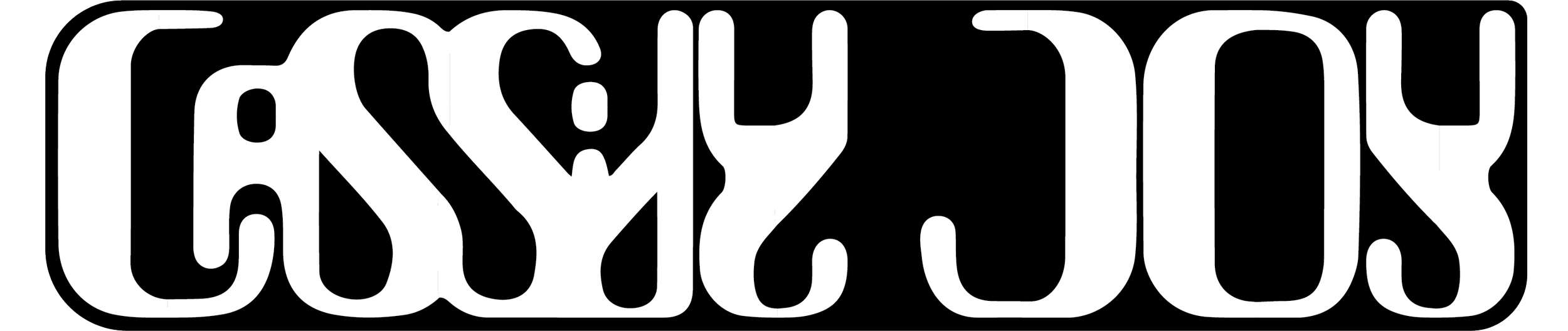
Cassidy Joy is a U.S.-based DJ extraordinaire. We brainstormed ideas for a logo that would represent her brand, and after some collaboration, I created a dynamic logo pack to support her creative journey.


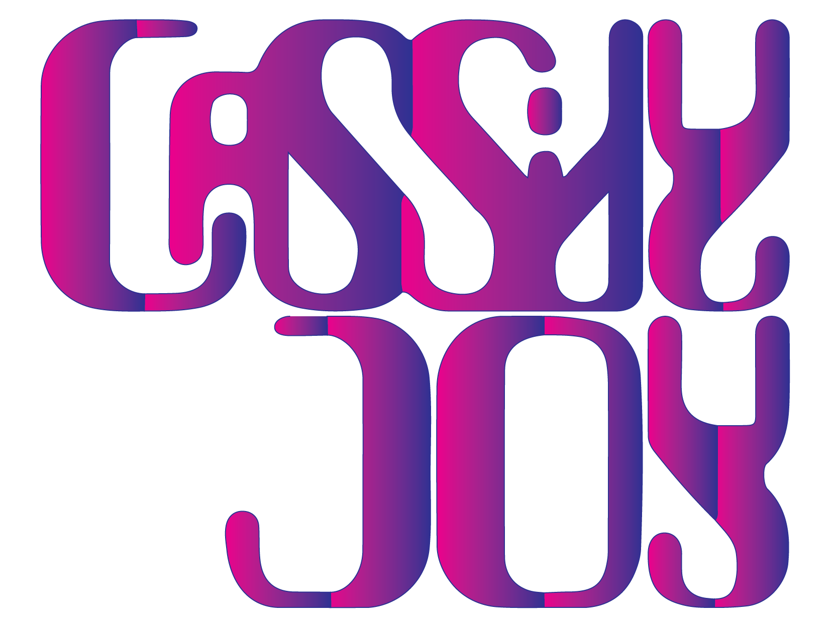
Through mood boards and brainstorming sessions, Cassidy and I developed a cohesive vision for her brand. We drew inspiration from words like harmony, strength, groove, clean, minimal, dark, edgy, bright, and bubbly to bring this concept to life.
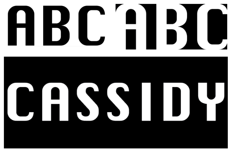
Starting with Silom Regular as the foundation, I customized the typeface by rounding corners, repeating motifs, and adjusting the letterforms. This new, unique typeface plays a crucial role in defining the brand’s identity.


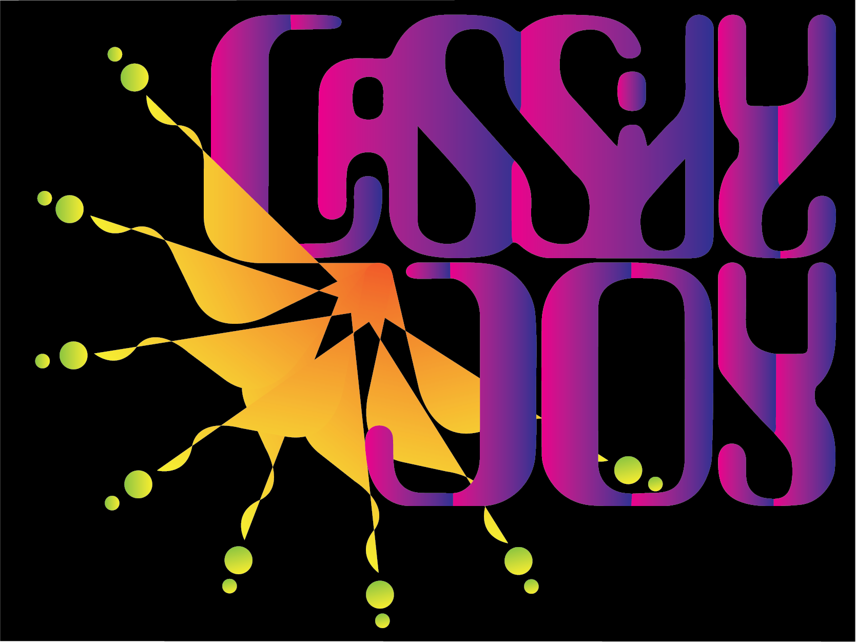
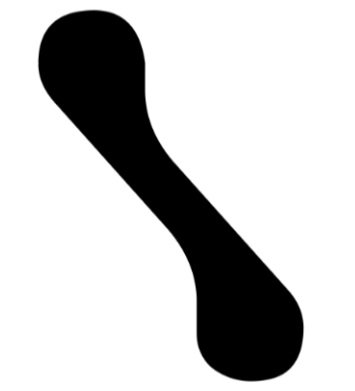
To add more visual interest, I introduced optional supplemental elements to the typography, creating a more dynamic and layered look.
Cassidy's imagery often featured suns, which I felt perfectly captured her bright, bubbly personality. To complement this, I chose vibrant, eye-catching colors that would really stand out against the brand's primary black-and-white color scheme.
The contrast of almost neon hues on black would bring the overall vibe to life.